top of page

TAZO REBRAND
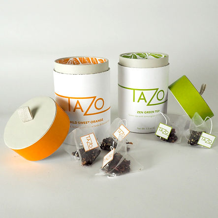
Tasked with the rebrand of Tazo Tea, I took the meaning of Tazo ("river of life", "fresh"), and implemented those concepts into my design. This added more depth to their brand image.
To express the adjective "fresh", I kept the package design very clean and minimalist, with high contrast between white and color. To demonstrate the "river of life", the logo wraps around the container, leading a continuous line through the 'T' and 'Z' of Tazo.
bottom of page